
8 Easy Ways to Stylize Your Lettering

Sometimes, when you're focused on lettering every day you'll step back and look at your pieces and notice a sameness - you gravitate toward the styles you've gotten a better grasp of, and you stop challenging yourself. Or you notice you're not even looking for opportunities to get a little more creative or decorative with your type. When I notice this happening, I like to take a familiar word and try to style it up as much as possible. Wearing the same outfit every day is boring. Let's give your lettering some brand new clothes!
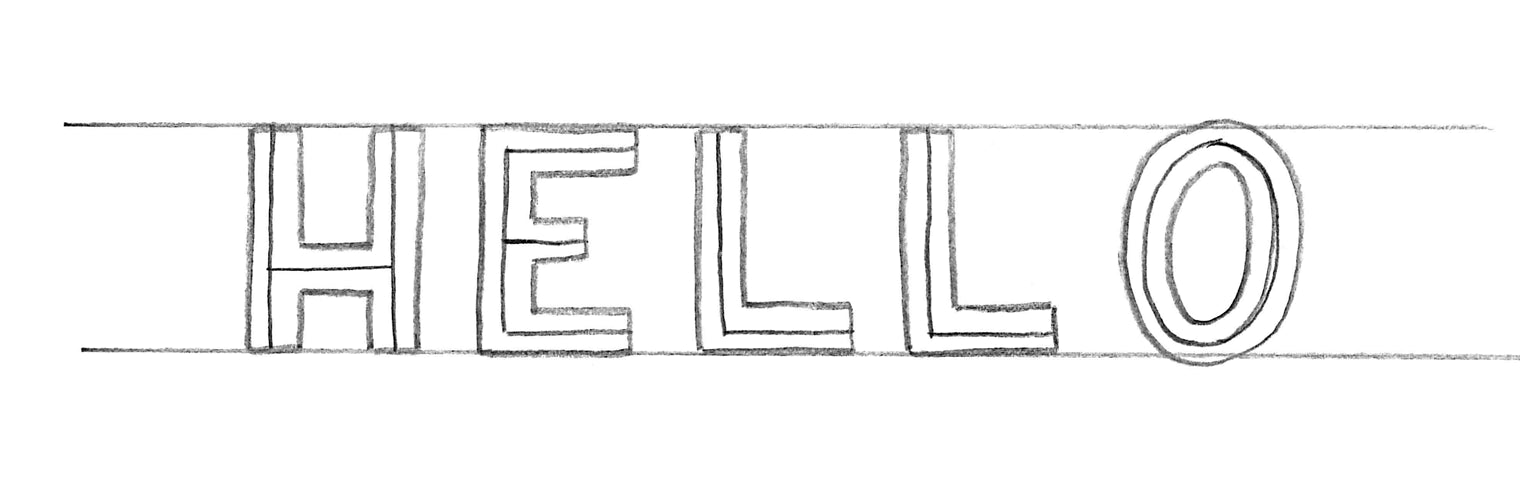
Mono-weight sans serif type is usually how I finalize a layout, before I think about adding any style (unless that style will affect the layout, like something with a lot of flourishes or swashes). It's easy to grasp the layout when the type has a little body rather than just a skeleton, so you have a sense of their final visual weight, and you don't want to get bogged down in the details just yet. While this lettering style is fine, it's not exactly stopping people in the street. Here are 8 ways to dress that baby up (and yes, you can use more than one!).
Add Contrast

Try varying the contrast of your strokes. If your pen would go down, or down and to the right to form a stroke, that stroke should be thicker. If your pen would go up, or up and to the right, that's a thinner stroke. If you need a refresher on upstrokes vs. downstrokes, this post on script lettering will help. Thicker downstrokes and thicker upstrokes go beyond script type!
Experiment with Different Crossbars

There are endless crossbar styles out there, all of which will add some personality to your piece. In this case I went with a diagonal, but you can make your crossbar high, low, curved, or even represented by a circle floating in between your strokes rather than a connective bar. Anything that creates a visual bridge between the two strokes you need to connect will work. Certain crossbars will evoke a certain time period of typography - very low crossbars tend to feel midcentury, whereas high crossbars evoke an art nouveau, early 1900's style.
Play with Median Spurs

Spurs are small projections off of the main stroke of a letter. They can be added to the terminals of letters as a type of serif, or added around the middle of a letter (called a median spur) for some additional interest. Median spurs often lend a bit of a Western feel to lettering.
Add Decorative Terminals

Decorative serifs are one of my favorite ways to make text stand out. Styles you'll see frequently include bifurcated (what you see above), trifurcated (similar to above, but with an additional third curve), and ball terminals (transitioning terminals of strokes into a ball, like in the typeface Mastadoni). You can also experiment with illustrative terminals, like serifs that look like leaves or other botanical elements.
Fill in with Ornamental & Illustrative Details

With ornamental or illustrative details, the sky is the limit. You can keep it simple, adding shapes that follow the curvature of the letter (I’m partial to a dot at the median with two teardrop/petal shapes following the stroke), or add small illustrations that relate to the meaning of the piece. If it’s a piece mentioning the outdoors, you can add leaves or flowers to the inside or outside of your lettering. If it’s about winter, you can add some snow sitting on the top of each letter.
Add Inline Detail
Another way to dress up plain lettering is to add hairline strokes inside your type - either straight through the middle, like above, or by following the outline of the letter to essentially create another small version of the letter inside. You can even get crazy and add drop shade to your inline, to give your piece additional depth.
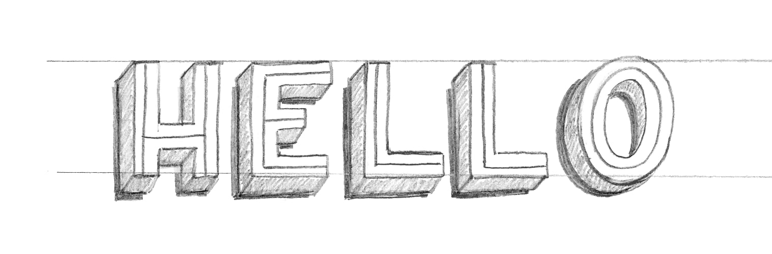
Make it 3D

I’m a big fan of 3D type - it can be used to instantly make important words stand out, and there’s more than one way to create a 3D effect. The most common way is to add a drop shade at a consistent angle, and connect that shade to your original letter. You can have all of the shade receding toward a single perspective point, or add lines and shading to create 3D facets within your letter. You can also change how you fill in the 3D type - with line details, a solid color, or shaded based on the angle of your imaginary light!
For a really fun effect, when you ink your drawing, try shading in and outlining only the 3D portion of your lettering. The letters will still be easy to read but will actually be created by the negative space!
Cast a Drop Line or Shadow

A drop line or shadow is a quick and easy way to give your lettering a little dimension and make it stand out from other letters. I tend toward adding my shadows down and to the left, but just make sure you consistently follow the same imaginary light angle throughout your piece.
Mix & Combine
With these 8 different style options (and many possibilities within each option), there are a million different ways to stylize a letter, especially if you combine them! Examples of wonderfully stylized type are everywhere. If you feel your styles have gotten stale or repetitive, look to type from different periods for inspiration!
Hopefully these examples gave you a little inspiration for your current projects. I'd love to see what you've created - share a link to your latest work in the comments!
