

I’ve emphasized the importance of guidelines in many of my posts, but one mistake many new letterers make is setting up guidelines and following them too strictly. Setting up your guidelines and drawing every letter precisely to the edges of your guides sounds like a foolproof plan, right? Well, not exactly. Thanks to a little optical illusion known as the Müller Lyer Illusion, your letters will actually end up looking like they’re different heights, and thicker in some spots than others.
Even if you’re brand new to the lettering and type world, you’ve probably encountered this effect without even realizing it, through examples like this:

So how exactly does this affect your lettering, and how do you fix it?
Think of Letters as Three Shapes
All characters can be lumped into one of these three shapes: squares, circles, and triangles. Square shapes, like H and M, are relatively simple - they can follow the baseline and cap height and have no problems at all. Circular letters like O or C look shorter than square letters. Triangular letters, like A, tend to look even shorter than circular or square letters.

Take a look at the image above. Do you notice how less of the circle and triangle touches the cap line? This is what causes the illusion. When characters are mathematically the exact same height, they don't actually look like they are.
When you’re drawing a circular letter or a triangular letter, you’ll need to adjust for this by drawing circles and triangles a bit taller than your guideline - this is called overshoot. If you don’t, circular and triangular letters will look smaller even if they are the same height as square letters.

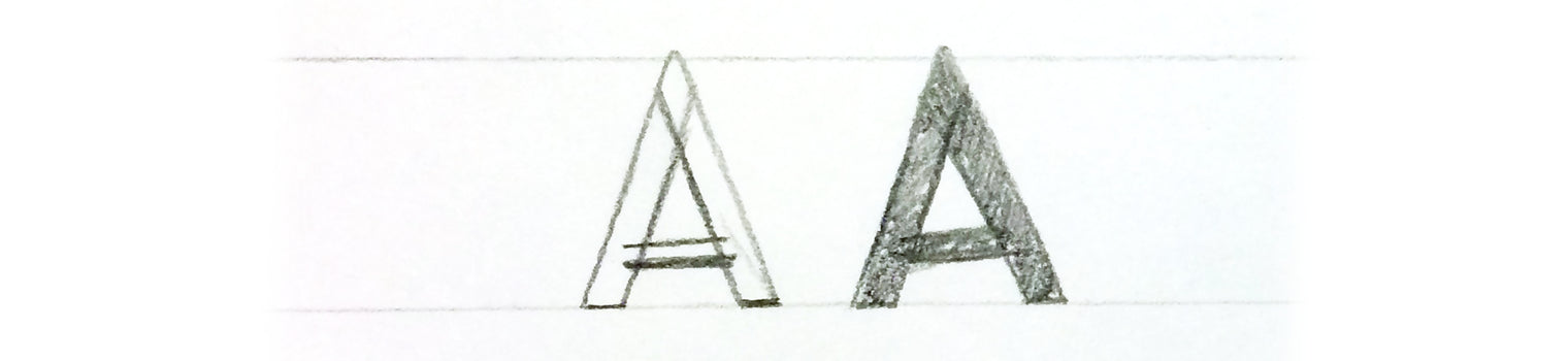
Remember, Horizontals Look Heavier Than Verticals
Horizontal lines, like the crossbars of A and H, look heavier than verticals. To adjust for this, make them a bit thinner than the other strokes of the letter.

Don’t Work Only With Outlines
Working with only outlines of your text can make it tough to accurately get a feel for the visual weight of every stroke. Filling in your lettering can help you really see how heavy your letters are, so you can tell if you’ve successfully outsmarted the tricks our brains play on us.
If you’ve been noticing that no matter how exact you are with your guidelines, some of your letters seem to look smaller than others when you’re finished, don’t fret! After you learn to make a few small corrections to your lettering, you’ll be outsmarting our silly, broken brains.
If you make these adjustments, your letters will look even, and you’ll be the only one who knows they’re actually not!
