
The Complete Guide to Serifs (and How to Draw Them!)
Serif styles are one of the staple classifications of typography. A serif is that little extra stroke found at the end of main vertical and horizontal strokes of letterforms. Georgia is an example of a serif.
Arial is an example of a sans serif.
Serifs have been classified many different ways, but the terminology gets confusing. There are a lot of overlapping terms for the same types of serif, which can make knowing what's what as clear as mud. Over time, the terms for different serif styles have evolved, but confusingly, the old terms are still used (resulting in multiple names for the same style).
Let's try to clear things up!
Important Terminology
Before we get started, there are some important terms that we're going to be repeating.
Bracket: This is a rounded line that connects a serif to the stroke of the letter for a smooth transition
Contrast: In this case, we'll be referring to the difference between the thickest part of the letter and the thinnest.
Hairline: A very thin stroke
Other basic typography anatomy terms (this drawing from SeanWes is a great visual dictionary).
Old Style/Humanist/Traditional

Old-style serif fonts meant to imitate brush strokes of old school scribes, so they have a softer, rounded appearance. This serif style has smooth, rounded transitions between the thick and thin strokes, and the transition into the serifs (which have slightly rounded edges) is a very gradual, smooth slope. This type style has a hand-crafted look, rather than the sharper, more machine-made look of a transitional or modern serif. For a good example of this style, take a look at Garamond.

Drawing this style is relatively easy, as imperfections are part of the historic, handmade charm of old style serifs. Draw a letter as you normally would, giving all of the body some weight. Then thicken the down strokes a bit - the contrast in this style of type is not very dramatic. Then, draw a thin, rounded rectangle for each serif. If you look closely at Garamond, every 90 degree angle has been softened with a rounded edge, including the transition into each serif.
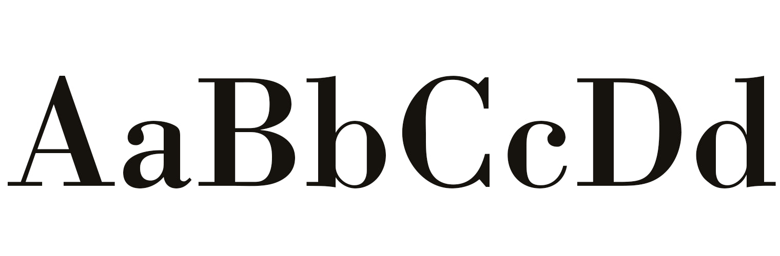
Transitional/Bracketed
Transitional serifs are more pronounced and sharper than old style serifs. John Baskerville was the English printer and typographer who pioneered this style thanks to some advances in printing methods, so Baskerville is a shining typeface example. The curved edge that connects the stroke and the serif is a bracket, so you'll often see this style referred to as bracketed. The brackets of transitional serif fonts are rounded and smooth but the edges of the serifs are very square. This type style feels much more machine made and modern, as the 90-degree angles and perfectly straight lines are difficult to achieve by hand. It's known as "transitional" because this type style is a big step toward modern styles, but keeps characteristics of old style serifs.

Drawing this style is a little tougher as it demands more consistency than the old style serifs. Draw a letter as you normally would, giving all of the body some weight, and thicken the down strokes - the weight contrast in this style is more pronounced than old style serifs. Then, draw a thin, square-edged rectangle for each serif. Soften the transition into each serif with a smooth, rounded edge.
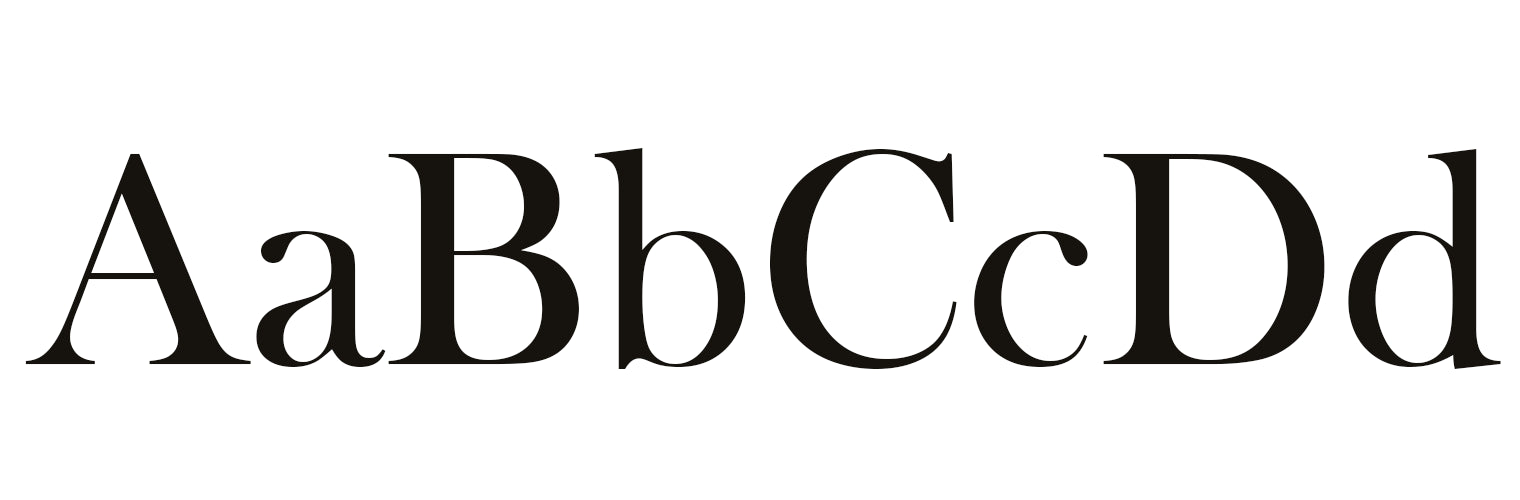
Didone/Hairline/Modern/Neoclassical
The hairline serif is pretty unmistakable. It's a very high-contrast style between thick and thin strokes, with narrow, unbracketed serifs. This is the style I showcased in my Vectorizing Serif Lettering tutorial. This serif can be seen in type styles like Didot and Bodoni. Sometimes you'll see this style with ball terminals (as in the lowercase c and a in the image above), but otherwise, this style maintains a very modern, clean, unornamented appearance.
This style has probably gone through the biggest identity crisis. When this style first came out, typefaces like this were referred to as Classical. This was confusing because they weren't a new take on a classic style, like transitional was to old style. They were entirely new designs, and began a modern era of typography, so instead they became known as Modern. However, they're not really modern anymore, so now they're most commonly referred to as Didone (which is apparently a portmanteau of Didot and Bodoni, but Bodoni got the short end of that stick if you ask me...), in homage to the typefaces that pioneered this style. Sometimes you'll see them called Neoclassical, but it's not as common.

I find this style the easiest to draw, because drawing a serif essentially involves drawing a short straight line. Create a lot of contrast between thick and thin strokes -- downstrokes should be quite heavy, while the thinner strokes should maintain a hairline width, matching the weight of your serifs. Add thin, consistently weighted serifs, with no bracketing at all. The serifs on this style tend to be pretty long. If you want your thin strokes to be thicker than a hairline, just make sure your thin strokes and your serifs are the same weight, the edges are square, and that you maintain strong contrast between them and the upstrokes.
Slab/Egyptian
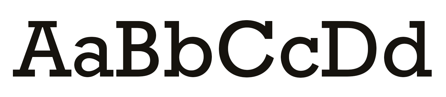
Slab serif type became popular in the 19th century as a display type. A commonly known typeface in this style is Rockwell. These typefaces have very heavy serifs with minimal changes in stroke weight, and no bracketing (when bracketing is added the style becomes Clarendon, which we'll get to!). This type style has a strong visual impact, so it was often used in advertising. It is also sometimes referred to as Egyptian.

I like to use the follow-along sans serif technique when I start this style, which helps in maintaining a consistent stroke weight. Add square-edged, rectangular serifs that are the same weight (or very close to the same weight) as your letter strokes. These serifs tend to be short or medium length.
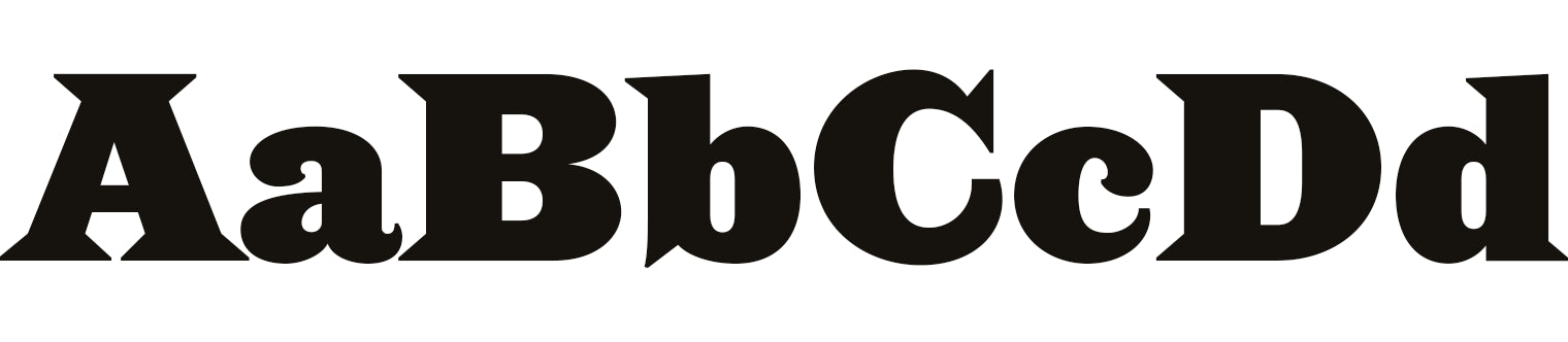
Clarendon/Bracketed Slab

This is sort of a sub-style of the slab serif, as it's not a very pervasive style and is seen in few typefaces. Like many others, this style is named after the typeface that pioneered it: Clarendon. Another display type style seen in the mid-19th century, the only difference between this and the slab serif is that it has gradual, rounded transitions into the serifs. Just as with slab serifs, their stroke contrast is very minimal and serifs are short or medium length.

To draw this style, follow the slab serif instructions above, but add a rounded transition into each serif.
Glyphic/Latin/Wedge/Semi-Serif
Glyphic serifs are usually triangular and tend to be more visually subtle, resembling the style of chiseled Roman lettering. In additional to triangular serifs, the legs of letters like R or K tend to subtly flare out a bit at the end rather than having a full serif. A good example of this style is Saracen (above) or Albertus. You will often find glyphic typefaces under the name "semi-serif", but the terms "latin" or "wedge" are also pretty prominent. This is another serif style that doesn't have strong contrast between thicks and thins. The transition into the triangular serif can either be smooth or abrupt, depending on the typeface.

To draw this style, draw a sans serif letter with minimal contrast between the thicks and thins, as with slab or old style serifs. Rather than a rectangle, draw triangles on either side of the stroke to form the serif. Subtly flare out legs at the end to give some additional visual interest.
Ornate/Decorative

This isn't really a formalized serif style you'll find in most places, but it's what I use to lump in any of the serif styles that don't really fit in the other categories, like bifurcated, trifurcated, or illustrative serifs like leaves, flowers, curls, etc.

There really is no one way to draw in this style, since it's kind of a catch-all category. The contrast between thicks and thins is entirely up to you. If you're doing a bifurcated serif to add a western vibe to your piece, that generally has only slight contrast between thicks and thins. If you're going for a botanical serif, maybe your entire letter is monoline, ending with serifs drawn out of two leaves! This is the serif category where you can really get inventive.
Wrapping Up
Hopefully now you have a better understanding of the different categories of serif type, and how they relate to one another. If you were keeping count, we went through 19 different terms that can be used to describe 7 different categories of serifs - no wonder this is often a confusing subject!
Personally, my favorite type of serif is probably Didone or decorative (love me some bifurcated serifs!). What's your favorite to draw?
