
How to Sketch Effectively
**The winner of last week's giveaway is Darcy T! Darcy, I'll be in touch soon about how to send you your prize!** Sketching is the most important part of the hand lettering process - your polished piece is only as good as your sketch. Done right, sketching helps you break a design into manageable pieces, build new lettering styles from their base, and plan an interesting and balanced layout.
Over the years, this sketching process has helped me make sense of approaching a complex design. An effective sketching process gives you a polished drawing ready for tracing with ink or lets you skip inking altogether and go straight to digitizing.
Start with Thumbnail Sketches

Thumbnail sketches are a quick way to evaluate compositions rather than relying on the picture in your head when you start a full size sketch. Before committing the time it takes to lay out a large, detailed sketch, I create very small versions of my chosen phrase to play with different compositions. I usually just frame out the skeleton of the letters, but if I know the style is going to affect the layout, I'll roughly sketch that here as well. This sketch is not supposed to be perfect (hence my lovely photo above).
This is the most effective and efficient use of my time, as it allows me to reconcile most layout issues before I get too deep into a sketch, and strengthens my overall compositions.
Thumbnails also help you be more open to experimentation - if a layout idea you have doesn’t work out, you haven’t invested a ton of time in trying to make it work. Get creative! Don’t feel obligated to stick to straight, perpendicular lines. Try out some slants or use curves. Or, letter a word or phrase inside a relevant shape.
Pro tip: I keep ALL thumbnail sketches as a catalog of layout concepts. If a concept doesn’t work out for this idea, it’s helpful to keep a visual of it in case it will work for a future piece!
Set up your Full Size Layout
Once you’ve landed on a layout you like based on your thumbnails, it’s time to set up for your full sketch. Here are a few tips that have helped me set up my sketch right the first time.
Effective sketches happen in layers. Start with a lighter lead (HB) for your guidelines and initial sketch, all the way through. Then move on to a darker layer as you start to finalize lines.
Measure, measure, measure! Draw guide lines so you know what needs to fit where. Often I won’t set an exact width for the layout, particularly if I’m just drawing one word. Sometimes you’ll want a more exact approach, and other times you’ll want to be more relaxed with your guides. It all depends on how precise you want your piece to be.
As you draw more, you’ll get a feel for how much space individual letters need to fit in a certain area. The great thing about hand lettering is you can turn a limitation into a creative opportunity, like adding style pieces to fill gaps in your layout.
Sketch in Stages
Once I have my guidelines drawn, I sketch in three major stages.

First, I draw out the skeleton of all of my letters. This is just the basic, monoline shape of them, like a thin sans serif font. If flourishes, accents, or connections between letters are going to be a significant part of your design, add the skeleton of them as well. If you know the style you're going to use will add significant width to your letters, give them some additional space in the skeleton stage.
Don't worry about being too perfect here. You want to be accurate in terms of the size of the letters and underlying details, like how high crossbars will sit or how circular your curved letters will be, but these will not be your final lines.

Next is the body - this is where you add the weight to each letter, as appropriate. Sometimes, all you’re going to want is the skeleton (particularly for less important words in a phrase). But generally, your letters are going to need a little more to them than the thin frame. Don’t worry about adding cosmetic style yet.
If you're imitating calligraphy, thicken the downstrokes (anywhere in the letter your hand moved down the create the line - this is when a calligraphy nib would open up, allowing more ink to flow across a wider line, making the stroke thicker). If you're creating block letters, maintain consistent width across all parts of your letters.
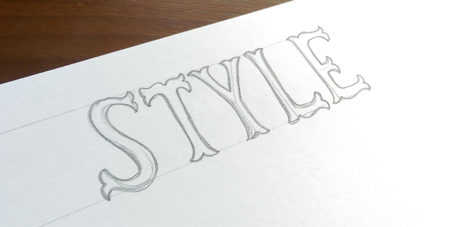
Finally, you can add the style, whether it be some ornaments inside the body of the text, serifs on the ends, median spurs, shadows, a 3D effect - you name it! This is also where you should evaluate your composition, and identify where you may want to add flourishes, ornaments, or other features to balance everything out.
This is often where I find ligature opportunities that may not have been obvious during my initial framing. Sometimes, even with the best layout plan, you realize at this point that it will look better if you extend the tail of your “y” a bit, or connect two letters together that you didn’t see an opportunity for before. Once you've figured out which lines are your final lines, use an eraser (or eraser stick, for finer details) to erase the other lines and clean up your sketch. Then, use a darker lead to darken the lines you're keeping. This will help you avoid any confusion when you start tracing your sketch with ink.
When it comes to style, focus on legibility over everything else. Don’t get so cutesy with your layout or style that the words are difficult to discern, whether it’s just hard to read or the words are emphasized in a way that makes them naturally read out of order. A hand lettering piece should be imperfect - after all, it is hand drawn. But if it’s not legible and the words don’t flow properly, what’s the point?
Start Inking!
At this point, your sketch is ready for ink! Your final sketch should contain every single detail you’re planning on putting into ink. Don’t plan to resolve anything while you ink a sketch. If you take the time to be thorough in your sketch, it’s far less likely you’ll have to start over during the inking process due to an errant line of ink.
This process may sound a little more time consuming than just diving in and winging it, but sketching this way is part of a deliberate practice process. It will help you improve and vary your layouts and lettering styles.
Do you have any additional sketching tips I missed here?
