
Tips and Tricks for Perfect Sans Serif Lettering
Sans serif type is possibly the most important fundamental style for hand lettering. It’s easy to learn, and it’s versatile - it's a great building block for more ornate styles. There are a lot of subtle features to sans serif type that are crucial for balanced, consistent letters. The average person reading your lettering won’t notice them, but if they’re not done correctly, they’ll be able to tell something is off. As a letterer, though, it's your job to know and address these issues! The major struggles I’ve experienced with drawing sans serif types include:
making sure letters are balanced (aka, they don’t look like they’re about to topple over)
maintaining consistent letter thickness (weight)
maintaining even space between letters (kerning)
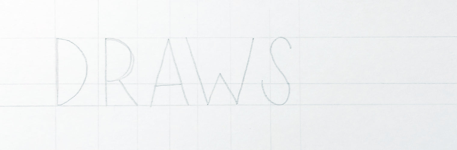
I’ve picked up a few tricks to address these struggles - let’s dive in! For this tutorial, I’ll be focusing on the word “DRAWS”. This is a great word to practice with as it has a good mix of straight edges, rounded edges, and diagonals.
Set Up Guides & Frame Your Sans Serif Letters
Set up your guides, similar to how you set them up during the formal script tutorial. For my sans serif style, I like the midline a bit lower, as I like the middle arm of my E and the bars of my H and E to sit lower. With script type, I set up a series of angled lines (called stress lines) to guide the angle of my lettering. For sans serif type, you’re generally going to want vertical lines, to make sure all of your straight edges are upright. These aren’t entirely necessary, but they can be helpful, particularly if your baseline is angled. Space them out every 1/2” to 1”, just like with the script type. This way, you’ll always have a guide nearby.
Once your guides are ready to go, frame out your letters to get a feel for how much space you have in the layout. To allow space for the weight of my letters, I usually start just a smidge (think about 1/8”) in from the edge of my layout and end the same amount in from the edge, and err on the side of spacing letters a little bit too far apart. This gives you a little extra breathing room around your letter frames for the body.
Add the Body

The initial body sketching step will involve a lot of lines crossing over each other - think of this like a blueprint. It’s much easier than trying to perfect a letter’s shape and weight by outline only. Not all of these lines are final lines, but drawing the structure this way will help you maintain consistent widths and keep everything proportionate.
Using your frame as a guide, define the first outside edge of your letter. Then, draw a line parallel to that line - the inside edge of that stroke - to define your stroke width. Use the tops of those sketch lines to start your next stroke (for the D in DRAWS, it will be the outside stroke of the bowl of your D) - this will help you maintain a consistent width. Then, draw the inside edge of the bowl of your D, making sure it’s creating as much weight as the straight edge of the D. Work through all of the letters similarly, until you get to the S.
Ahhh, the S. The bane of every letterer’s existence. My tried and true way to approach the S is to draw two circles (basically like an 8), with the top circle slightly smaller than the bottom. The top circle will guide the outside stroke edge of the top of your S, and the bottom circle will guide the outside stroke edge of the bottom of your S. Then you’ll just follow along your curved edge to complete the outline. You can see the circles in the sketch above.
Pay Attention To The Details

Upper arms (like the strokes on a K) or bowls (like in a B or R) should not extend as wide (or wider than) the lower arm or bowl - this will make your letters look like they’re off balance. The lower arm or bowl will act as a visual anchor for the letter when it’s wider than the bowl or arm.
Crossbars should be a little thinner than your upright strokes. Look at an A, H, or T in a san serif type face - if you measure, you’ll notice the crossbars are probably thinner, but visually hold the same weight.
Round letters should extend a little above and below the baseline and capline. The space they take up appears smaller than a letter with hard edges, so you need to compensate.
Diagonal strokes shouldn’t connect to the ends of your upright stroke lines exactly - that will make them too thin.
Now that you’ve sketched out the body, it’s time to comb over it to find any problem areas.
Maintaining Consistent Weight
As you go through the rest of the word, look back at previous letters to make sure your structure lines are the same width apart. At the end of your first round of sketching with the full body of the lettering, take a step back - do any letters look too heavy? Too thin? You may need to lightly fill in the letters with your HB lead to get a good feel for the visual weight. Sometimes, when I want to be exact, I’ll bust out my ruler and measure the widths. Note problem letters, and refine your sketch. Repeat until you’re satisfied with the weight and shape of every letter.
Maintaining Consistent Kerning
When you’re drawing a word, you need to make sure you have room for each letter, but you also need to make sure each letter has room to breath. It takes time to develop a good eye for letter spacing because it’s not based on an exact measurement - it’s often about perceived space (much like how round letters need to extend above and below the baseline and capline).
All letters are some combination of rounded lines, straight lines, and diagonal lines. So within that, you have 6 potential combinations to kern. Here are some quick rules about the relationships between different letter shapes (not all letters are created equal, so take it with a grain of salt...):
Two straight edges: Like MN. Visually the heaviest. Should have the most space between edges.
Two rounded edges: Like OC. Visually the lightest. Should have the least space between their narrowest point.
Two diagonal edges: Like AV. Should be spaced about the same as straight edges, but measured on a diagonal.
One straight, one diagonal: Like MA. This one’s the toughest. The narrowest point should be spaced about the same as two rounded edges - probably even a little tighter. The letters will almost touch at their narrowest point.
One straight, one rounded: Like MO. The narrowest point should be a little narrower than two straight edges, but a little wider than two round edges.
One rounded, one diagonal: Like OA. The narrowest point should be a little narrower than one straight, one rounded.
One trick I use often to check my kerning is to flip my drawing upside down. This keeps you from getting distracted by reading the piece and allows you to focus on the shapes. Over time, you'll develop mental kerning pairs - letters you see next to each other frequently, and are familiar with how to space them - and proper letter spacing will come more naturally.
Ink What You’ll Keep

Once you’re happy with the weight and shape of all of your letters, you’re going to ink only the lines that actually form the outline of your letter. You can either do this directly over your sketch, if you have a good eraser, or with tracing paper or a light pad.
Voila! You have an incredibly straight and consistent sans serif word. With a lot of practice, this process will get faster, and you’ll eventually be able to skip some steps. You’ll develop some muscle memory about how certain letters are formed, and you’ll be able to work with fewer guides and fewer structure lines to nail it.
Take Your Time
The key to improving your sans serif lettering is to take your time and keep a steady hand - you’re working with a lot of lines that need to be straight. When you see a finished piece out in the world, it’s difficult to appreciate the time, work, and thought that went into the piece. The sped up start-to-finish videos you see on Instagram are awesome for a quick insight into an artist’s process, but they don’t reflect the true pace artists generally draw. Take it slow - you’ll keep a steadier hand, your lines will be straighter, and maintaining consistent lettering weight will be much easier.
Since we weren’t able to cover every letter of the alphabet, I’ve created a printable guide available for download, so you can see how all of the letters in my personal sans serif style are constructed.
If you have any tried-and-true tricks you use to form certain letters, please share them! What letters do you struggle with the most?
